As I began my latest body of landscape work, I needed to work through what I was going to draw and paint, and the accompanying considerations of my working method. This included subject matter, compositional strategy, how much detail I would include in each piece, and what media I would work in. I needed to start somewhere, and although the subjects of my early sketches included Martha’s Vineyard and Arizona, the subject of my first series ended up being Hawaii.
I had visited The Big Island of Hawaii several times with my wife’s family, and each time we stayed on the Kohala Coast (the northwest coast of the island). The view to the north was of the gentle slope of the Kohala volcano, and that image had stayed with me ever since the first time I had set eyes on it. I chose this subject for the first series of pieces I would create.
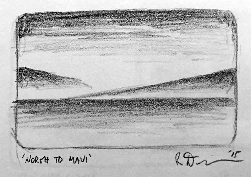
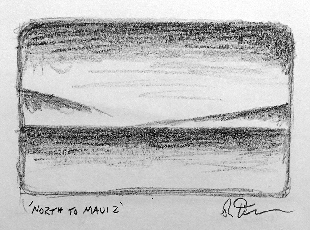
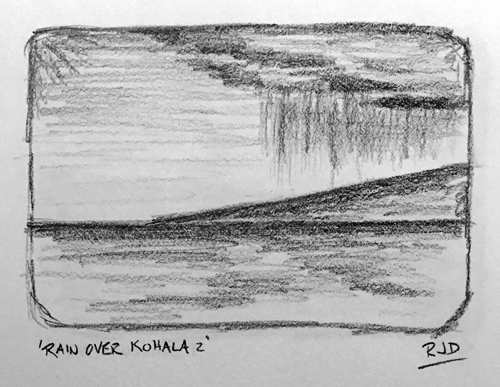
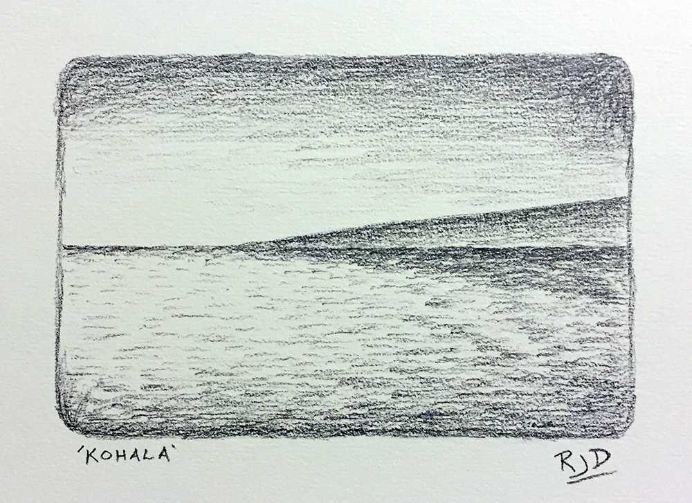
After doing a series of sketches (seen in the gallery below), I ended up choosing the simplest composition of the group that included just a few simple shapes — rectangular sky, rectangular sea, and triangular volcano. This was an almost abstract composition, which allowed me to avoid details, and focus on explorations of color, light and atmosphere. I created an initial pencil drawing of this composition before moving on to color.
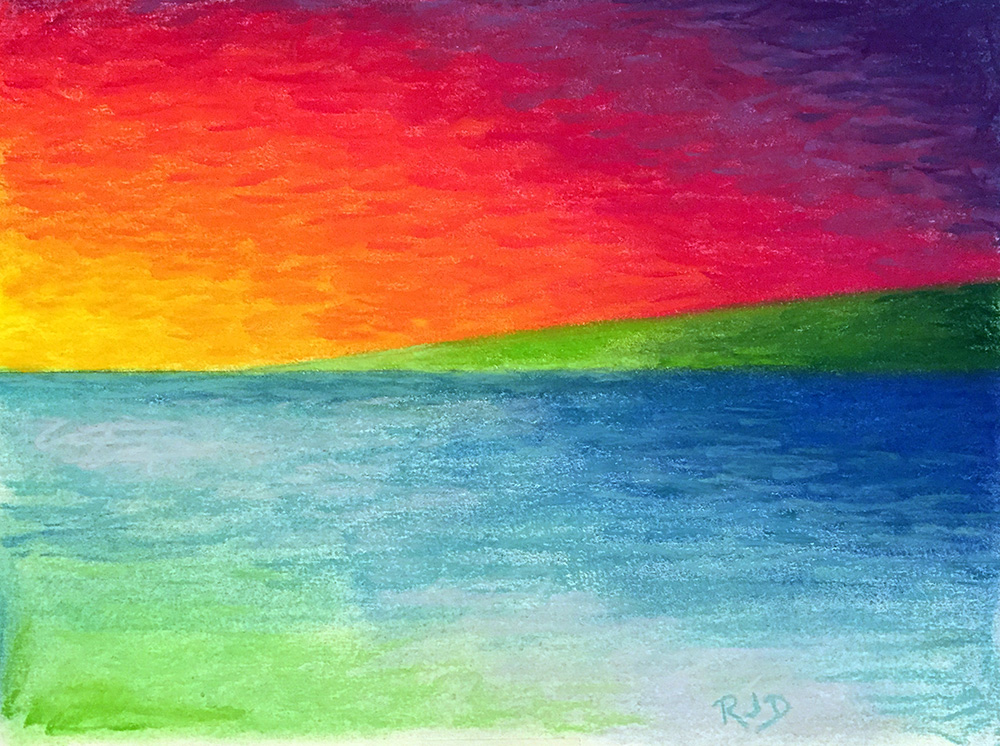
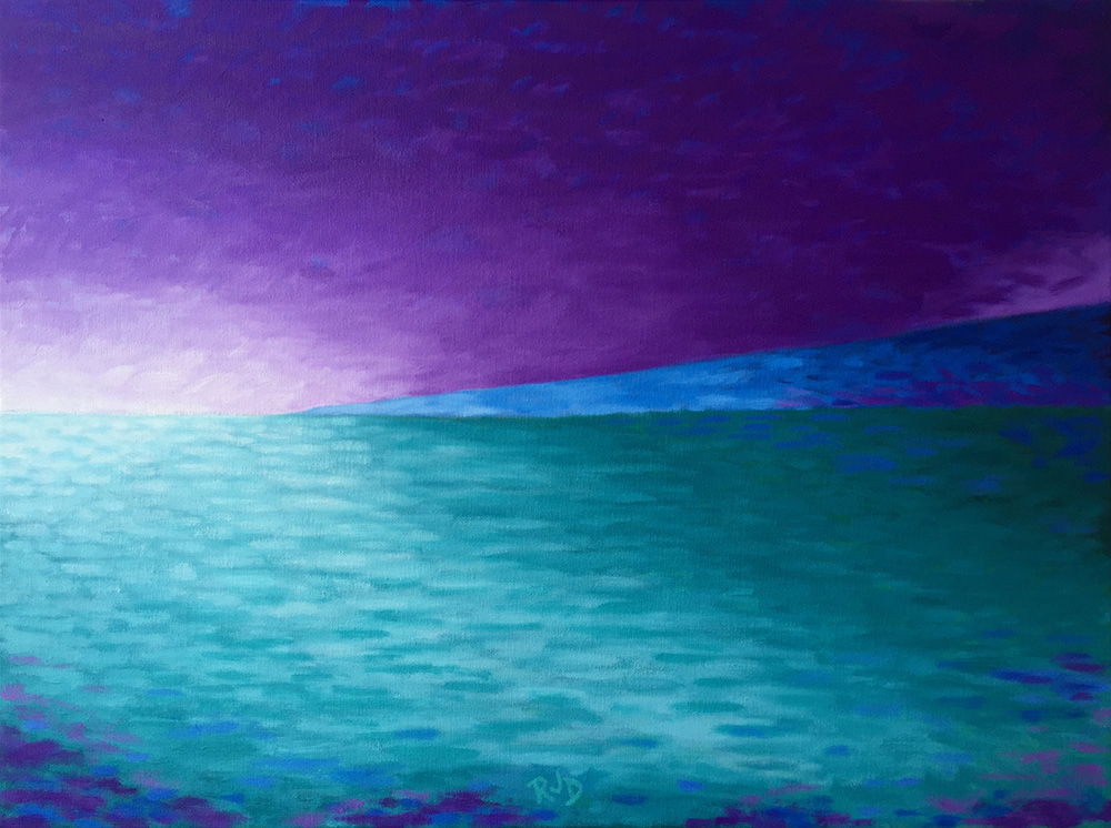
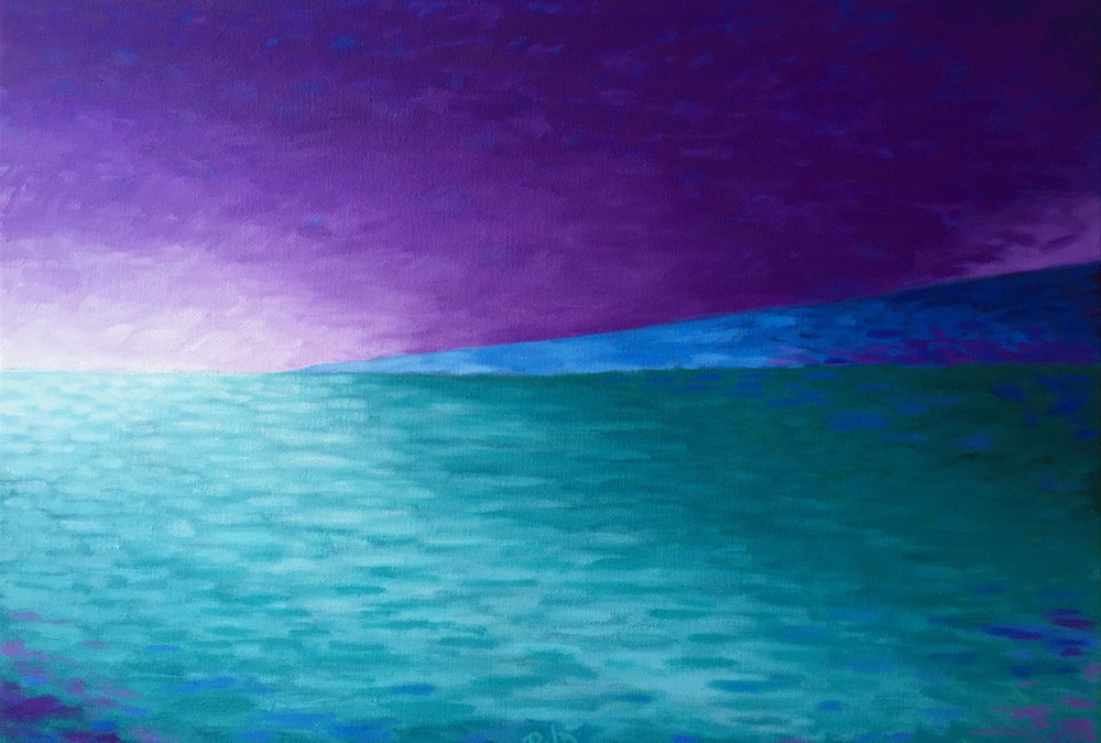
The first pastel I created was brightly colored, with an orange, red and purple sky, green land mass, and an ocean of blues and greens. The second pastel utilized a cool palette of purples and blues, reminiscent of early evening or even pre-dawn light. The first oil painting of the series was loosely based on the second pastel, and as the painting developed, an interesting light and atmosphere developed in the left sky area, which I then reflected in the water extending toward the bottom of the frame. Above the land area I added a dark purple sky that was taken from a memory of a storm I saw over the volcano to the north during one of my first visits to the island. My goal was to use the cool color palette to create a mood that was both calming and dramatic.
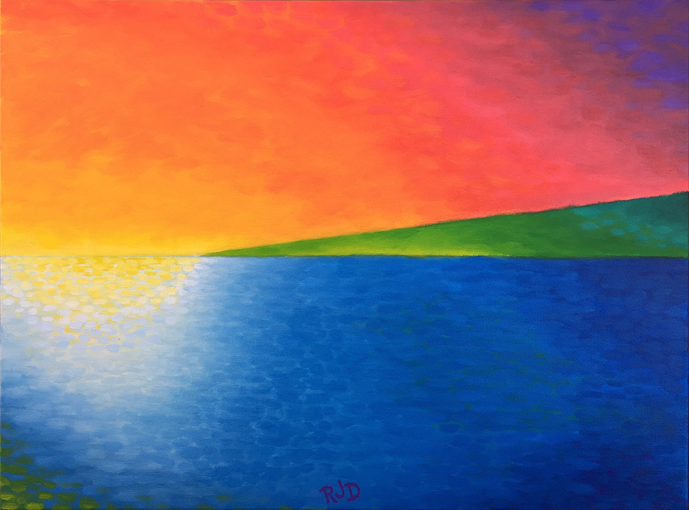
The second oil painting I created was based on the first pastel, and used a similar bright color palette. This piece was an exercise in color abstraction, of pushing the color well beyond what was observed. I used a bright orange for the sky, bright greens for the volcano, and blues for the water, with a bright reflection in the left area. under the horizon line. My use of light and color in this piece was deliberately non-representational, and my goal was to use a compelling combination of warm and cool colors within the simple composition that would capture the viewer’s attention.
I enjoyed using the simple, almost abstract composition in tandem with different color palettes to create different effects in each piece. I’ll most likely revisit the Kohala series in the future to further explore other combinations of composition, color, light and atmosphere.